Kia Stinger
5000 Posts Club!
It looks like the real thing is going to be an oval as well...


That looks bad
but thats not the latest font ?? I say its a Transition
Yeah, I know - but if they're already created the emblems - I think they may just use that specific version on their products. I get the feeling there's going to be several variations of the design. I guess we'll know for sure later...but thats not the latest font ?? I say its a Transition
I don't think it's the oval - but I think some people think they should think it's the oval.Is it the oval that annoys most badge swappers? I thought it was the lettering KIA. I have nothing against either. And the new KIA design looks no better or worse than the current disparaged KIA, imho. Without the oval, meh? Same difference, to me.

Tell us what you really think!I don't think it's the oval - but I think some people think they should think it's the oval.
I think the oval itself plays a very small part. If any part at all. I don't think it looks bad - but these are just my opinions. I saw somebody on social media mention is looking like the Nine Inch Nails logo...Tell us what you really think!

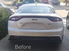
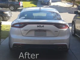
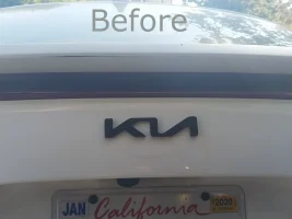
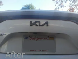
It looks good but think the small one looks better , the new one look a bit too big to my eyesI made the logo bigger cuz I thought the previous was a little small. Before and after pics.

")
I agree. Too big. The small one works best. However - that's an opinion which will likely vary...It looks good but think the small one looks better , the new one look a bit too big to my eyes
Before you spend time perfecting one or the other, take a vote on the size. Whichever one people like better, well, you know.The smaller one made it look empty around that area. I also did it bigger and thicker cuz I want to see if it warps in direct sunlight.