You are using an out of date browser. It may not display this or other websites correctly.
You should upgrade or use an alternative browser.
You should upgrade or use an alternative browser.
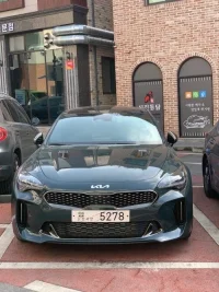
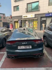
2022 Stinger Spy shot with changed Kia logo
- Thread starter jbae064
- Start date
Transmetal
1000 Posts Club!
- Joined
- Jul 4, 2020
- Messages
- 1,407
- Reaction score
- 782
- Points
- 118
Hmmmmmm
If people didn't know we are driving Kia's already, they definitely won't know now. Still looks like Nine Inch Nails to me. The Stinger script on the back as it currently is on the 19,20,21 is much better than that. And what's with those MASSIVE exhaust tips? Not a fan.
If people didn't know we are driving Kia's already, they definitely won't know now. Still looks like Nine Inch Nails to me. The Stinger script on the back as it currently is on the 19,20,21 is much better than that. And what's with those MASSIVE exhaust tips? Not a fan.
Blue Bucket
Active Member
Nope. Hard pass. Especially on the back.
______________________________
Jayphil
Active Member
- Joined
- Feb 25, 2020
- Messages
- 433
- Reaction score
- 340
- Points
- 68
Front is ok, better vs the current oval KIA Logo. The back is too big, the current Stinger script look much better.
Hopefully on the back the way they will make the holes behind the logo will not make it impossible to retrofit to the Stinger script...
Hopefully on the back the way they will make the holes behind the logo will not make it impossible to retrofit to the Stinger script...
From interior to exterior to high performance - everything you need for your Stinger awaits you...
Stratofied
Member
- Joined
- Oct 24, 2020
- Messages
- 37
- Reaction score
- 20
- Points
- 8
I agree, the front looks OK, not great, but the one on the back looks massive and terrible. Also, am I the only one who always sees the IA as a backwards N? KИ
Blanco_k8
Member
Welp I was hoping for a better implementation on the back but I'm in for the front, now who's selling them so I can rebadge?
Travis Wills
Stinger Enthusiast
- Joined
- Jun 9, 2019
- Messages
- 898
- Reaction score
- 582
- Points
- 98
I don’t like any of those exterior changes at all. The “E” badge is all they need. Now the interior changes I like but I wouldn’t trade my current car for just those changes if the exterior looks like that.
Blanco_k8
Member
Am I the only one that prefers the taillights the way they are? just feels very charger-ish in the new one
Lynix
Active Member
Front looks good, definitely the best option I've seen. Way better than current logo and "E" emblem. If anyone is selling let me know!
______________________________
From interior to exterior to high performance - everything you need for your Stinger awaits you...
Stratofied
Member
- Joined
- Oct 24, 2020
- Messages
- 37
- Reaction score
- 20
- Points
- 8
Nope, I love how the current tails look at night when they are lit up. More unique in my eyes. These new ones seem like they will look fine in the dark, but in daylight they are pretty ugly.Am I the only one that prefers the taillights the way they are? just feels very charger-ish in the new one
NS_Stinger
2500 Posts Club!
- Joined
- Jun 14, 2018
- Messages
- 2,527
- Reaction score
- 1,556
- Points
- 118
Oh man that logo scale and placement on the back is a mess haha
redraidersrule
Member
front looks ok. Back is hideous. Im gonna be pissed if the 2022 doesnt have the Stinger logo on the back middle since thats what I plan to buy.
MerlintheMad
10000 Posts Club!
Ditto: front looks striking; rear application is awkward and unattractive. I'm neutral on the refresh taillights, and will keep mine stock.
MerlintheMad
10000 Posts Club!
Absolutely; and especially so since there are times when I have to rethink how Ns really go (must be somewhat dyxlesic).I agree, the front looks OK, not great, but the one on the back looks massive and terrible. Also, am I the only one who always sees the IA as a backwards N? KИ
From interior to exterior to high performance - everything you need for your Stinger awaits you...
colnago1331
Active Member
- Joined
- Dec 16, 2020
- Messages
- 169
- Reaction score
- 195
- Points
- 43
The back looks awful. I wasn't a fan of the light bar across the hatch to begin with, and adding the new logo to it makes it that much worse.
The front is . . . meh. I like the new logo; I just think they would've been better off using the oval like what we have now and shrinking the new logo to fit it.
The front is . . . meh. I like the new logo; I just think they would've been better off using the oval like what we have now and shrinking the new logo to fit it.
westcoastGT
5000 Posts Club!
You lost me at Hi !
From interior to exterior to high performance - everything you need for your Stinger awaits you...


