
jbweb7
Member
- Joined
- Sep 23, 2017
- Messages
- 56
- Reaction score
- 26
- Points
- 18
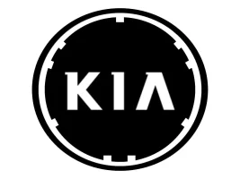
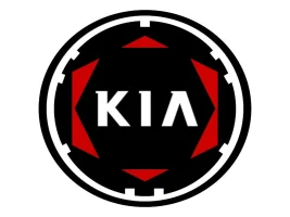
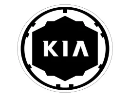
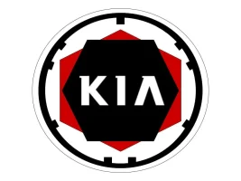
It seems everyone agrees the "Kia" badge is horrible. However, I hate it when people complain and don't offer a solution. What's yours? Here is what I came up with using basic shapes and the drawing tool in Google Drive. I used the original Kia 1953 logo as inspiration, which is included below. FYI, the Korean "K" is not really a Kia logo, but it is an improvement.
Attachments


Last edited:

")